 |
|
351 songs received votes. The average number of points obtained by a song that got any is 29.6 . In his commentary on the song results, O'Leary said that the top six songs (6. "Sound And Vision", 5. "Life On Mars?", 4. "Sweet Thing / Candidate / Sweet Thing (Reprise)", 3. "Ashes To Ashes", 2. "Station to Station" and 1. " "Heroes" ") quickly separated themselves from the rest during the count. These are clearly visible as spikes on the song chart. O'Leary himself did not vote, but lists his favourites here. David Bowie probably didn't vote, but his favourites (as of 2008) make the iSelect compilation and he once said that The Buddha of Suburbia was his favourite from his own albums. I didn't vote, but my favourites (including consideration of Blackstar and its songs) are here. Album names: The Rise and Fall of Ziggy Stardust and the Spiders from Mars is abbreviated to Ziggy Stardust, and Scary Monsters (And Super Creeps) is abbreviated to Scary Monsters. David Bowie (1969) is called Space Oddity here. Leon and 1. Outside are treated as a single album denoted by Leon / 1. Outside, such that a point for Leon or 1. Outside was a point for Leon / 1. Outside (this isn't how O'Leary handled the two in the poll, but it's what I'm doing here). The final album officially has a symbolic title, ★, but it's called Blackstar here. Blackstar (2016) has no points (except for some of its songs) because the poll predates it. About the song titles: they're each prefixed with their year because that's how I got tableau to sort them chronologically, sort of. The tableau documentation says it's possible to sort one field (like song names) by another (like song years), but I couldn't find this feature, possibly because it doesn't actually exist (yet). So I got tableau to sort by song name, after I (procedurally) prefixed the names with the years. It isn't perfect - songs from albums released in the same year get mixed up on the song chart - but still beats me having to sort 351 songs manually. To give each album a sum-of-songs points score (explained below), I had to assign each song with an album.
If a song appeared in more than one album, I assigned it to the album with which it is most commonly associated.
So "Strangers When We Meet", for example, is treated as a song from 1. Outside rather than The Buddha of Suburbia, but it retains the year of its initial release, 1993.
This is how Heathen (2002) contains a song from 1969 ("Conversation Piece").
The next-most-important source of data for this viz was wikipedia and its pages on the Bowie albums. From these I gathered review ratings and chart performance data. The next view of the viz shows these data: |
 |
|
About the professional numerical ratings: these numbers were either star ratings out of five, or (in the case of Pitchfork) out of 10. For the purpose of the heatmap, these were normalised to values between zero and one and then displayed according to the colours shown in the bar. Some of these are from the era in which the respective album was released, others are far more recent. The review quotes shown in the mouseover text for each publication is usually from the same piece in which the publication's numerical rating was published, but not always. For the Rolling Stone numbers, I preferred to take these from the review piece, but if not available, this number is from the The Rolling Stone Album Guide. In the case of Pitchfork, the original articles the numerical ratings are from are slowly being replaced by more recent reviews of re-releases written by different authors, so the review quotes on these (up to and including Never Let Me Down) are from the more recent reviews. More on the review quotes. Nicholas Pegg and Chris O'Leary don't score albums numerically in their books/blog, but their thoughts are worth having. Pegg's commentary is from his book The Complete David Bowie, O'Leary's commentary is mostly from his blog Pushing Ahead of the Dame, but also from his books Rebel Rebel and Ashes To Ashes. Adding review quotes seemed like a simple enough job at inception - include more than just numbers, simply by selecting commentary from each review piece - but turned out to be a job and a half. Selecting a line from a review piece that is a balance between being summative of the album in question, representative of the reviewer's overall opinion and interesting requires a judgement that wasn't always easy. That and with about 30 albums and 7 reviewers, I had to read 100+ review pieces. It added up and maybe I should have seen that coming before I started . . . but it's done now. Then there's the chart data.
The display is simple enough, and I found myself clicking on the albums in chronological order.
If you find yourself doing something like that, I might be able to save you some clicks with this animation (which was also a job and a half), from David Bowie (1967) to Blackstar (2016):

3. Patterns and Correlations in the Data Motor sensational Paris or maybe Hell I'm waiting Clutches of sad remains - "Aladdin Sane (1913-1938-197?)" (Aladdin Sane) So at this point we have the Pushing Ahead of the Dame poll points, numerical review ratings and peak chart positions. On the next view of the viz, we search for patterns and correlations in these data: |
 |
|
What we have are essentially measures of album quality, by three distinct groups: devoted fans (readers of Pushing Ahead of the Dame), professional reviewers and the mass audience (charts). Sales data would be a better measurement of mass audience opinion than charts, but if there is a good source of these data that is at least as complete as the chart data, I don't know it. Anyway, the comparisons between the measures show that there are some correlations, but also, inevitably, discord. The clearest source of discord is the chart data, which (judging from the number 1 albums, marked in red) don't correlate with any other measure of quality. The best albums, according to devoted fans and reviewers, tended not to reach number 1, while some of the worst did. So the mass audience clearly has a different ear, but there is also a delay effect - albums that reach number 1 not because they are necessarily any good, but because they are bought in accordance with the expectations raised by previous albums. Reviewers and devoted fans were closer, however, as evidenced by the plots. At face value (just looking at the linear coefficients of determination), the reviewer ratings correlate more strongly with the summed song points than the album points, but from looking at the scatter this appears to be a result of fitting a line to a relation that isn't really linear: there is a ceiling on reviewer scores (at one - remember that these scores are normalised to values between zero and one), but not on album/song points. In limit-speak (anyone?), I would expect a nonlinear trend, whereby reviewer ratings approach one as the points approach infinity. Blackstar, of course, should be excluded from the fit because its data are incomplete, and can be - just click on that data point and exclude it, the fit adjusts accordingly. Despite the reasonable correlation, there are albums that devoted fans liked more than reviewers: Low, Station to Station, Diamond Dogs and Leon / 1. Outside. A theory that comes to mind is that there are qualities of these albums that become most apparent upon repeated listening, as done by devoted fans who listen to these repeatedly for years. Reviewers were kinder to Tin Machine than devoted fans. The last plot I did here was album points vs song points.
Both of these measures are from the Pushing Ahead of the Dame poll, which was in two parts: votes on songs, and votes on albums.
One might wonder whether a vote on albums was necessary - couldn't we just look at the song results and come up with a total for each album based on the performance of its constituent songs?
Of course, the reason for doing an album poll as well is that we can like an album for more than the songs it contains - there is also the coherence, sound, style and artistry of an album that can make it more than the sum of its parts.
By plotting these data against one another, we can identify which albums these are (according to devoted fans) - and they do stand out clearly - Low and Station to Station.
Low was the winner of the album poll, but Hunky Dory would have won if the song data alone were used.
With these three measures of album quality, I defined three criteria: loved by devoted fans if awarded more than the average number of album points in the poll, critically-acclaimed if holding an average normalised reviewer rating of at least 0.7 (that's four out of 5 stars, after rounding to the nearest whole number of stars) and number 1 on the UK chart. Which makes this Venn diagram, with some zeroes that sing for you at the bottom: 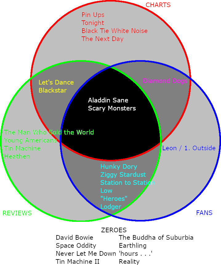
It's harsh to call the albums at the bottom "Zeroes", because almost all listeners will identify some music that they think is great down there, but they met zero of the criteria defined above.
If a consensus-great album is one that meets all criteria, it's at the centre of the diagram.
Scary Monsters is supposed to be the last consensus-great Bowie album (before Blackstar), and the three measures here do agree about its greatness.
The only other album to enjoy this consensus is Aladdin Sane.
Blackstar was both critically-acclaimed and a number 1, missing out on consensus greatness here by being too late for the reader poll . . . I guess we'll never know, but there are indications that it might have reached the centre otherwise.
At the top of the album poll (here, specifically), O'Leary writes 'The mid-1970s were Bowie’s golden age, at least according to this poll.' By looking at the poll data from start to finish (chronologically) we can add further numerical weight and precision. On this final view of the viz, we plot points against time in years (which we actually haven't done in previous views). On the album plot, click on albums to show constituent songs in the song plot; on the song plot, mouseover to identify the most prominent songs in each year. What the album and song plots do not give us is a simple scalar measure of Bowie's prominence in each year. Such a measure should consider both the quantity and quality of albums, and the last item here is a pair of Gaussian-smoothed series based on the album data that attempt this by showing Bowie's ``presence" in each year. This presence is based on album quality and quantity as indicated by the 2015 poll, and doesn't always correlate with popularity. He was most popular with the mass audience in the 1980s, but this is also the most critically-derided decade of his career, the most unloved by both reviewers and devoted fans alike. One of these "smoothed presence" series estimates the effect of Blackstar, which did not attract any album points in the 2015 poll because it was released in the following year. On the plot of smoothed presence, mouseover to identify the albums responsible for the calculated smoothed presence in each year (but in many years there were no albums). |
 |
|
On the plot of "smoothed presence", the album points are "smeared out" with a Gaussian filter (coded by yours truly). The width of this filter is the span of Bowie's career divided by the number of albums (minus one), and then doubled (to go from a radius to a width). This measure allows us to numerically consider both the individual prominence of albums, and their quantity in any given era. Two series are plotted: one of these is based on the album points as recorded by the poll, while the other includes a guess at what impact Blackstar might have had if it had been in the poll. Blackstar's album points are estimated using its average reviewer rating and the reviewer-rating-album points linear relation fitted on the previous view of the viz. Based on that, it might have attracted 229 points . . . but this is, of course, very speculative - there's a huge uncertainty on that. Either way, if we define Bowie's golden age / golden years as the time during which his smoothed presence was at least half of its (1976) peak, we find that these years were 1971-1979.
The Album and Song Point data are from Chris O'Leary's Pushing Ahead of the Dame blog. Thanks to everyone who voted in the poll, and to Chris both for administering the poll and posting the data. The professional ratings and chart data are from Wikipedia. Review quotes from AllMusic, Encyclopedia of Popular Music, Pitchfork, Rolling Stone and Spin are from articles online (where available). Commentary attributed to Nicholas Pegg is from his book The Complete David Bowie. Commentary attributed to Chris O'Leary (except his writing for Pitchfork) is from his blog Pushing Ahead of the Dame and books (Rebel Rebel and Ashes To Ashes). Which I heartily recommend.
This viz was reviewed and improved by Tram Trinh of MIP Sydney.
To see the viz by itself, without the additional features on this page, look here.
The data I used can be found here.
|