 |
|
In the principal component space, temperatures and the anthropogenic forcings all increase to the right. This shows that they tend to rise and fall together. Vectors for the natural forcings are essentially perpendicular to the others, so they have little to do with either human activity or with the overall trend in temperature. These inferences are confirmed by the projections shown, of forcings onto temperature and human population. The most extreme data point, 1992, followed the eruption of Mount Pinatubo in 1991. That did signifiantly affect temperature, but the natural forcings can only help to explain year-to-year temperature variation, and some trends over periods of a few years - not the overall trend. This is highlighted most clearly by the plot in the bottom left. Here we show the contributions of each forcing to warming, according to ANModel. Earlier in the project we spelt out the terms of this model in a formula. The contributions of specific forcings to warming are the corresponding terms in that formula. The natural forcings all oscillate, in some years causing cooling relative to the base period. The sense in which stratospheric aerosols ever lead to warming is indirect: when there are no significant volcanic eruptions, there is effective warming, relative to the base period. If that project has a conclusion, it might be the column chart comparing the anthropogenic and natural contributions to warming. Here we compare the contributions of anthropogenic and natural forcings to warming, which vary over time. These are averaged contributions over the period of time set by the sliders on the right. To see the average contributions of anthropogenic and natural forcings for a particular timespan, type the start and end years, or use the sliders. There is one year in which, according to this, the natural contribution to warming was greater: 1987.
But no others.
If we look at 2010 by adjusting the start and end sliders to that year, the combined warming from anthropogenic greenhouse gases is 0.5 degrees.
This is consistent with (at the bottom end of) the IPCC's assessed likely range for warming over the 1951-2010 period attributable to well-mixed greenhouse gases (Figure 1.9 in the IPCC's Climate Change 2014 Synthesis Report).

What the PCA tells us is that to predict the temperature anomaly, the most important features from the models tested are the GHGs - essentially, AModel.
The natural features have some predictive potential, but the additional accuracy they could provide would be marginal, especially if we are interested in large timescales, over which there will be more significant uncertainties.
Moreover, while we have some idea how GHG concentrations may vary over this century - via their covariance with human population - most of the natural forcings exhibit periodicity that has no perceptible trend.
Put another way, GHG concentrations are enough to help us predict the trend of warming, which the natural forcings do not.
This trend, rather than the precise temperature anomaly in any specific year, is what we are trying to predict.
It is the anthropogenic forcings that can help us to do this, so these are the features we proceed with.
So our features to predict the temperature anomaly in any given year are that year's carbon dioxide concentration, methane concentration and nitrous oxide concentration.
These are well-mixed gases, with the mixing as a process that takes up to three years.
For this reason, we technically use three additional features (for a total of six), one for the concentration of each GHG in the year before.
Since the GHG concentrations are increasing with time, predictions for future temperature anomaly rely on values outside the training data space.
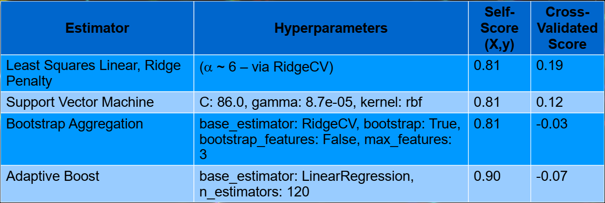
So KNN and tree-based algorithms fail; some algorithms that work are gridsearched, leading to these results:
These aren't great numbers - the most important reason is that we only have 33 observations: years in which data (GHG concentrations) are available.
Each individual CV fold's score is based on a comparison with 6 or 7 data points.
So even if our estimator is predicting the trend well, any amount of scatter (which there certainly is) from individual years results in a low CV score.
These scores are also more of an indication that we might not be so good at predicting the temperature anomaly in any individual year - but this is not our goal!
To be sure that our estimator is doing a decent job, we have a look at how it performs over the last three decades:
Three of the four estimators are in excellent agreement, and fit the trend nicely.
Boosting overfits, and all other estimators have R2 = 0.81.
They would probably return very similar predictions, but linear ridge regression has a marginally better CV score than the others.
In the previous project we found that a linear model went well, so this isn't surprising.
A more basic reason that this shouldn't surprise is that we are looking at (relatively) small perturbations from an equilibrium state of the climate system.
We certainly don't expect the temperature anomaly to generally be a linear function of the GHG concentrations, but for small perturbations from equilibrium, it's plausible.
To predict temperature anomaly over this century with our estimator, we need to first estimate GHG concentrations over that time.
These can be crudely predicted with a series of linear fits between population, GDP, emissions and GHGs.
GHG concentrations increase with emissions, which in turn result from human activity.
A proxy for human activity is GDP, and this is related to population.
So we perform a series of fits to historical data: population-GDP, GDP-emissions and emissions-concentrations.
We take the coefficients from these fits and use them to predict, based on predicted population, how GHG concentrations will vary over this century.
We can't integrate these fits into the temperature estimator because:
We obtain population predictions from the UN, GDP numbers from the World Bank and GDP post-pandemic predictions from IMF.
GHG emissions data are also from the World Bank, and GHG concentrations for the last three decades from various sources (often NASA).
Temperature anomaly data are from HadCRUT.
Our sources are listed here.
The GDP prediction is not a simple fit.
We first fit GDP per capita to time, and then multiply this by population to predict total GDP.
This is the base prediction - GDP, as well as other time-varying parameters, is modified by other effects throughout the simulation, as we describe below.
From a data standpoint, the unprecedented nature of the pandemic is part of what makes a simulation necessary.
The effects of the pandemic are many, and we don't include all of them.
The ones we do include are:
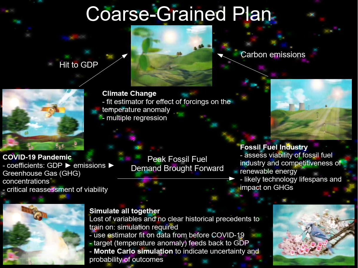
The various parts of the simulation are described below.
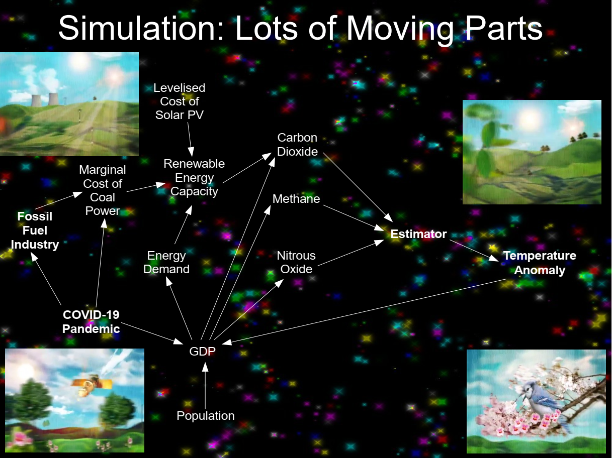
Our simulation discretises time, such that the various quantities are calculated for each year of the simulation.
The most important of these quantities are shown in the diagram above.
Time is run forward from 2020 until 2100.
The temperature anomaly estimator is used within the simulation at each time step, to predict just one temperature anomaly.
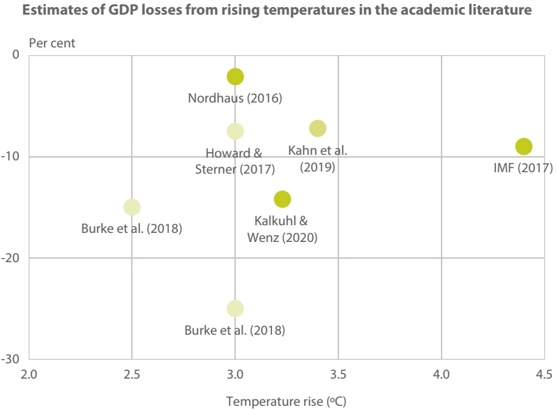
Effect: Temperature Anomaly Hurts GDP: We take the predicted temperature anomaly from each time step and reduce GDP for the next time step.
We use Kalkuhl & Wenz (2.0-2.9% per degree of warming), but the estimated impact varies considerably.
It's expected that the impact of warming does not increase linearly.
This has not been incorporated into our simulation.
A figure from NGFS Climate Scenarios showing the variation of estimated impacts is:
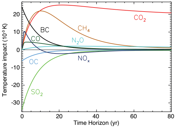
Effect: Lifetime of Greenhouse Gases (GHGs): The persistence of different GHGs in the atmosphere varies considerably.
Carbon dioxide (CO2) gets "top billing" not because it is the most potent, but because it tends to linger in the atmosphere.
Concentration half-lives are reported as lifetimes by the IPCC.
Figure 8.29 from the 2013 IPCC report:
Pandemic and GDP: The pandemic reduces GDP, and we can use the GDP-carbon emission correlation to adjust the predicted carbon dioxide concentration.
If we assume that GDP is 8% lower during the pandemic than it would otherwise be, it makes no significant impact on warming, even for a 10-year pandemic.
The temperature anomaly in 2100 is different, but only by about a hundredth of a degree.
This is because carbon dioxide persists in the atmosphere for a century or more, and the effect of the reduced emission is "smeared out" over that time.
Some hard numbers can make this easier to understand: if the temerature anomaly is determined by emissions over the preceding hundred years, a 10% reduction for 10% of that hundred years would only reduce the change by about 10% of 10%, or 1%.
Pandemic vs Fossil Fuel Industry: The pandemic has delivered an immediate hit to GDP, causing a deep recession.
The fossil fuel industry has been expanding until now, but it requires investment: capital expenditure to develop fuel reserves.
So while almost all industries are vulnerable during a recession, the fossil fuel industry is especially vulnerable.
The COVID recession means less money for investment, and what money remains is likely to go where there is less risk.
Reduced demand has led to falling fossil fuel prices (oil prices have gone negative, coal price has fallen from $80 in 2019 to $50 in July 2020, in US dollars per tonne).
The fossil fuel industry is really not the place to be for the risk-averse.
The industry is likely to get real about the costs: As much anything else, the recession has forced a critical re-evaluation of the fossil fuel industry's future.
The best evidence that it hasn't been doing this is that coal power stations were still being built just before the pandemic - even though they've been less competitive than solar (and wind) farms for at least 5 years.
Getting real about this will, among other things, make the industry more predictable, which helps us.
Renewable Alternative?
But challengers to conventional coal power face an uphill battle.
Coal is proven technology, the plants are already built and we know how to scale the technology up for mass-reliability.
Any challenger needs to go way beyond technological proof-of-concept.
It needs to compete with established infrastructure, not just physical, but economic and political as well.
The Cost of Being the Challenger: Fortunately, we can quantify the cost of being the challenger.
A challenger that lacks infrastructure needs to pass this cost on, making it less competitive.
So for the challenger, it's the Levelised Cost of Energy (LCOE) that counts, which is the cost that counts establishment - in large part, construction of the power plant or farm.
In most markets, because coal is established, challengers compete against the Marginal Cost (MC) of coal power, not its LCOE.
MC is much less than LCOE for any power generation method, so incumbency helps coal.
The Comparison That Counts: If we were comparing energy sources with a similar measure (LCOE), we would have stopped burning coal for electricity some time ago.
But because it's the challenger, solar PV has its LCOE pitted against coal's MC.
A severe handicap, but it is starting to become competitive on that basis.
Energy costs here are from Lazard:
Question: Will Solar LCOE Beat Coal MC?
We can fit a decaying exponential to the solar LCOE:
The constant term implies that it approaches $34, which it reaches by 2030.
This is basically the typical marginal cost of coal electricity.
So if this is what happens, in at least half the markets, we'd need to wait for coal power stations to reach end of life, and the usual lifetime of a coal power station is fifty years.
Early Closure of Coal Power Stations: For a significant fraction of markets, it looks like coal power stations could be closed early because running them would be more expensive than building new solar farms instead.
We find this fraction by comparing the predicted solar LCOE with the range of coal marginal cost.
Temperature anomaly is about half a degree lower by 2100, and rise is delayed by a decade or two.
Effect: End-of-Life Closure of Coal Power Stations: If we assume a new rationality, very few new coal power stations will be built.
We also assume that all existing coal stations will be closed 50 years after they began service.
We can (crudely) predict the curve of (maximum) coal power generation from historic output (using coal power from BP).
With the pandemic, coal power station projects in the developing world have been getting cancelled.
We simulate this by bringing forward the peak coal power generation capacity from 2030 to 2020.
Emissions are adjusted to match this decline to zero fifty years from now, in 2070.
But this effect is slight, because construction of new coal power stations was slowing anyway.
Summary of Pandemic Effects on Temperature Anomaly: A 10-year pandemic makes a difference, but only a few hundredths of a degree in 2100.
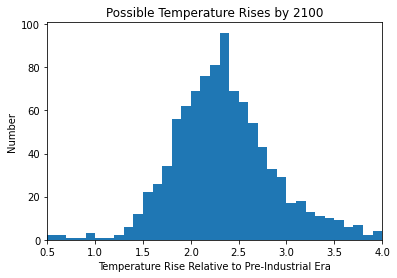
In 2100, the temperature anomaly is 2.2 degrees.
The temperature rise that people worry about is relative to pre-industrial times, and this would reach about 2.5 degrees.
Not quite "global hot house", but would trip some tipping points.
The reasons for the pandemic not having the effect on GHG concentrations in the manner we might expect are:

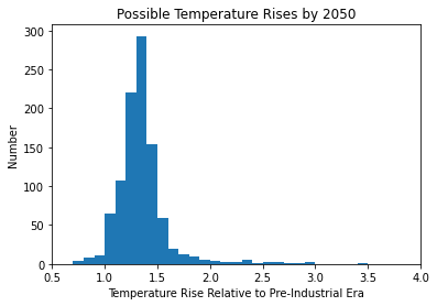
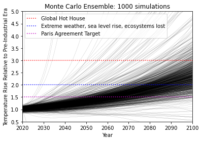
But so far, we have expectation values with no probabilities or uncertainties!
We run the simulation a thousand times with parameters varying like this:
To estimate the uncertainty in the underlying climate model, we:
The result when these estimators are compared with the past few decades looks like: 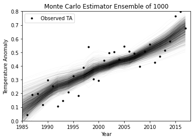
For all other parameters, we generate Gaussian distributions with the required central tendencies and spreads. The simulation is run once for each set of parameter values. 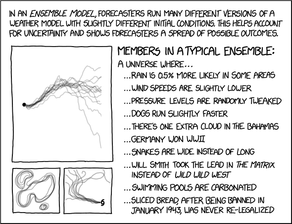
Probability of Avoiding a Temperature Rise of:
6. What Can We Do? I got a better way A new killer star I got a better way Ready, set, go - David Bowie, "New Killer Star" (Reality) 
Applying our crude model of energy pricing and market share, in which the fraction of market share taken by solar is directly related to the amount by which its LCOE beats coal's MC on price, we find that coal would be replaced completely by solar if it was subsidised at a rate of US$15/MWh. We need to remember, though, that this won't stop the warming, both because the carbon dioxide already in the atmosphere would hang around, and there are other GHGs that we're not modelling action on. But as far as the effect of coal goes, we can alter the subsidy for solar and watch how the effect on carbon dioxide changes the fraction of simulated futures in which the various temperature thresholds are crossed. A US$15/MWh subsidy might increase the probability of avoiding a 2-degree temperature rise by 2100 from about 20% to 30%. The world's total primary energy supply in 2017 was 162 494 TWh, and a thousand times as many MWh. With this as an upper limit, we can calculate that the cost of subsidising to ensure all of those MWh come from solar would be about 2.4 billion US dollars. If we did that right now, the cost for this year would only be 2.4 billion US dollars. The impact of a 2-degree temperature rise in 2100 would be at least 5% of then-GDP, perhaps 25 trillion US dollars. Probabilities are the numbers we want if we're curious about how likely particular futures are. But arguably, a better way to quantify the return on investment is by examining the change in the expected values. The most likely temperature rise by 2100 falls to 2.3 degrees. Considering the impact on GDP expected by Kalkuhl & Wenz 2018 with a conservative estimate of world GDP by then (US$500T), there might be a saving of about 2.5 trillion dollars . . . per year! So it's pretty clear that an investment of billions per year now will save trillions per year later.
The final calculations to reach those figures are crude, but what uncertainties remain unaccounted for would need to be huge to change the obvious advice - that solar energy is worth subsidising.
To run the code for all this, Python with numpy, pandas, scikit-learn, matplotlib plotly and oct2py are required.
oct2py is used as a bridge to Octave, which is also necessary.
To work, Octave needs to be installed and its executable on the path so Python (via oct2py) can find it.
There are 12 scripts, 10 written in python and 2 in octave.
The table below describes the scripts.
I would usually run nks.py to put variables in the workspace required for the simulation to work.
Then run the simulation (sim.py), saving the results so simresults.py can be run whenever.
As I write this, I still haven't got around to posting the code here.
But when I get a moment . . .
8. Acknowledgements Data Sources
The earlier analysis I did can be found here. The data I used, along with code I wrote, can be found here. Numerical analysis (apart from the basic computations) was carried out with Python (plus numpy, pandas, scikit-learn, oct2py, matplotlib and plotly) and GNU Octave. The title of this work is also a David Bowie song, "New Killer Star" (Reality). Illustrations on this page: Stills from the "New Killer Star" music video. 
|